Delivered as a part of the Pulte Institute Lecture Series underwritten by the Ford Foundation at the University of Notre Dame Eck Visitors Center on April 25, 2023.
What is global inequality? Technically, global inequality is inequality among all citizens of the world. Income inequality is simply considering income after taxes and social transfers over the course of one year.
Whether we take this room, this campus, the whole city, the whole state, the United States, or look globally — technically, it is all calculated the same way.
However, it is much harder to calculate it for seven or eight billion people than for 20 people. But everyone is treated the same. You divide their household income by the number of people in the household and assign that income to everybody in that household. You can do that for the entire world.
Now, how do I get information for seven billion people? I get it from household surveys that are nationally representative of 130 countries, which cover about 95 percent of the world's GDP and about 90 percent of the global population.

So, global inequality is underestimated because 10 percent of the world's population, those from very poor countries, is not generally included. These people often live in regions at war, or in conflict, and they do not have income distribution data and field surveys.
The earliest income numbers are from 1820, and the Maddison Project Database provides information on comparative economic growth and income levels over the long run.
What is striking is that if you look at the Gini Index — a summary measure of income inequality — which is a number that moves from 0 (complete equality where everyone receives an equal share) to 100 (complete inequality). You see that in 1820, just after the Napoleonic Wars, it was about 55. Throughout the 19th century, it kept on rising. This is a critical point, and you will soon see why it really matters.
The Gini Index kept rising in the first half of the 20th century. There were, of course, setbacks from World War I and the Great Depression. But World War II and the creation of the Tripartite World is significant. In this system, there is the First World, countries with the highest incomes and declining inequality; the Second World, made up of communist countries with lower inequality and the lower income countries of the Third World, mostly Asia and Africa, and to some extent Latin America. There were clearly three worlds, but that division began to crumble with the rise of Asia. And now there’s this third period, driven primarily by China, India, and Vietnam.
So, in the 19th century, the gaps between countries are increasing. However, with the rise of Asia we see the very opposite, we have country convergence because large countries that were relatively poor, like China, begin to catch up. At the same time, there is increasing inequality during the 19th century in advanced countries. The UK, for example, experienced peak inequality in the 1860s and 1870s.
What I want to highlight is quite abstract: global inequality charts known developments but in a particular and new light.
Now I would like to shift focus to the most recent period, which I call the greatest reshuffle of individual income positions since the Industrial Revolution. The example of US versus China is fairly well-known; adjusting the data for purchasing power parity, China overtakes the US around 2015. I’d like to look at India versus Germany, a lesser-known comparison. In the 1970s, Germany was 70% of the world’s GDP, and that’s actually just West Germany. By comparison, the entirety of India was just 3%. Now it’s the reverse; India is 80% of the world’s GDP, and Germany is 3%. That’s a big change that is then reflected in personal income inequality. That’s why I call it a great reshuffle. Countries that go down in rankings do not necessarily go down in real incomes but in their percentile position.
Consider global income distribution in 2018. Compared to 1988, many more people fall in the middle of the global income distribution, which we’ll call a global middle class, meaning their annual income is between $3000 and $13,000. That is where the rising Asian countries are largely located now.
The first period of high globalization can be shown by the Lakner-Milanovic graph, also known as the elephant curve.
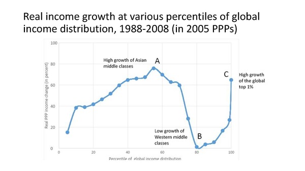
The graph was made popular by Trump because it illustrates a poignant political dilemma. That is, from 1988 to 2008, the global top 1% experiences around a 60% increase, the income of the global middle (annual incomes between $3000 and $13,000) increased 70-80%, but the upper-middle class experienced little to no growth in wages as a result of globalization those 20 years.
The financial crisis has significantly affected the global top 1 percent, which is still composed largely of Western European countries, the US, and Japan. One-half of the population in the global top 1% are Americans, so a lot depends on what happens here. We know it took five years for the top US stock to recover, and therefore we know that the crisis had a real impact on global incomes.
So there were really two different periods in the current globalization. There was 1988-2008, which produced the elephant, and then there were the next ten years, 2008-2018.
I graphed this growth from 2008-2018 with several interesting patterns.
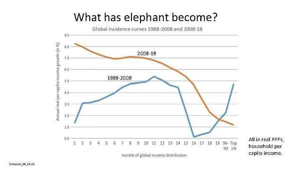
I’ll start with the bottom quintile, which is complicated because it’s very ironic what happened here. It’s essentially China moving its rural population from the bottom 20 percent.
China evacuates everybody from the bottom. This means that even if someone’s real income experiences zero growth when their income today is compared to those of people ten years before, it seems like they’ve done well. Which is why it seems like the bottom quintile has done well.
Now, this is not just an appearance because there are quite a few countries that are in the bottom quintile that have high growth per annum: Vietnam (12.5 percent); Ethiopia (almost 9 percent); Ghana (10 percent); and Kenya (7 percent). However, many poor countries still have 80-90 percent of their population in the bottom quintile. The growth rate is not only of the poorest people but could instead be driven by the growth rate of the 90th percentile in Tanzania.
In the bottom quintile, there are two effects: China is moving its rural population out of the bottom 20 percent, and the other is growth in a few poor countries.
What happens in the middle is less complicated but more striking, politically salient, and relevant for rich countries. Looking at Chinese urban deciles, almost a billion people ranking them from lowest to highest and then rank them within the global income distribution by their percentile. In 1988, even the highest decile in China was around the 67th percentile. By 2018, that group is now at the 97th percentile in the world. That’s not a huge surprise, but if you have the reshuffle, that means somebody must go down.
For example, Italy had almost no growth in 20 years, meaning that as the Chinese percentiles grew, Italy’s poorest went down in the rankings while the wealthy were unaffected. The same goes for Poland; if you want to irritate the Polish, you can point out that in 1988 under Jaruzelski’s government, the position of the bottom deciles in Poland was better globally than it is now. They’ll say, “How is that possible? We are one of the most successful transition countries. Since 1992, we’ve never had a negative growth rate.” It’s possible because they were in the part of the global distribution that was competing with Asia; Asia grew at 8% and Poland only grew at 5%. It's a similar story in the US at the bottom 30%, but 70% of the US population stands positionally where they were before.
The global top 1% is still mostly populated by the rich from Western countries. It’s not within the Chinese range. However, the question then becomes, what if the gap in income growth between Asia and the West continues? It doesn’t even need to continue at the same 8% gap, it could be 2%. This will lead to massive changes in the global income ranking.
Why do we care where we’re ranked globally, if most people don’t even know where their decile ranks? It matters a lot in one’s ability to purchase certain goods that are priced globally. Oftentimes, those are vanity goods, luxury items, but they are nevertheless items that a lot of middle and upper-middle class people in Western countries and Japan have become used to. These are things like attending sporting events, art festivals, and going on vacations.
Additionally, there is a clear geopolitical, economic, and military impact. In The Future of Capitalism, Paul Collier notes that when he was growing up and Englishman could go anywhere in the world and he would be seen as a very powerful guy because he had money, but now an Englishman is not viewed the same internationally. You will not be seen the same if you’re in the 95th global percentile versus the 65th.
In summary, there was a change in the shape of the global income distribution, which now looks more like a bell curve, more like a single country’s curve. Associated with that is the rise of the global middle class. There is also an interesting reshuffling of global income positions. All very dramatic changes over a relatively quick period, 30-40 years.
I will finish with something that I only did recently, I asked myself what a lot of people have been asking, “When will China catch up with the US?” Typically, this question is thought of in terms of GDP per capita, but GDP per capita in China is about 1/3 that of the US and when it does catch up, its national GDP will be 4x that of the US. So that’s not a good measure.
If the question then becomes, “When will China have the same number of people who are equal to the number of people that the US has in the upper 50% of its population?” We find the US median and take everyone above that, about 165 million people. Then we ask, when will Chain have 165 million people in that particular group; it currently has only 40 million there. If the gap in growth is 3% (meaning, for example, the US grows at 2 percent and China grows at 5 percent), it will take 20 years or one generation (or 30 years with a 2% growth gap). Of course, various assumptions are being made that we can play around with to slightly alter these time frames.
The key point is that we are currently witnessing the last period of significant dramatic change in the world distribution of income and, thereby, the world distribution of power.